Seed
Create a new project with Berry, starting with the minimum setup.
As a company with years of experience in crafting templates, we have observed that users often struggle with utilizing all the components included in most admin templates. If you have ever downloaded an admin template, you may have found yourself asking questions such as,
"How can I use components in the project?"
"How can I create a new project and set up theme/components?"
"Can I have minimal code-base to start?" etc.
If you ever found yourself in such a situation, we came here to the rescue.
Berry is designed with an extensive collection of ready-to-use components, each with a high degree of customization options, allowing for easy integration into any project. We've made sure to include as many components as possible to make your development process more efficient.
In this Integration guide, we are going to explain how you can create a new project with minimal setup and integrate some components as per your needs. So let's get started.
Get started with Seed
When you purchase the Berry, it comes with a pre-defined structure, the Seed version, which allows you to start immediately. The Seed folder directory is built using react-script, which includes minimal files from the full version to give you a head start. It has all the necessary dependencies preloaded in the package.json, so you don't have to worry about adding any additional ones unless needed. The Seed version includes a sample page, pre-configured routes, menus, styles, and settings, which can save you a significant amount of time in setting up a new project.
The seed version is available in the purchased package.
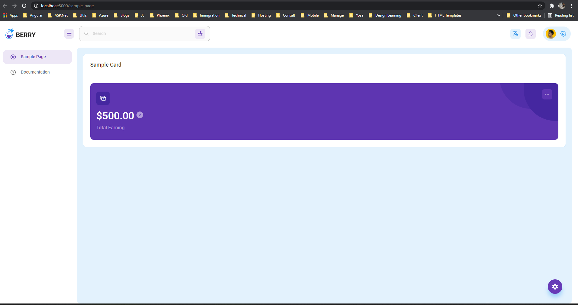
When you run the project using yarn/npm, you will see a minimal site like below:

It provides you with a very simple and intuitive structure to get started with a new project. You can add new components from the full version. Now let's see how we can do that.
Add components to the seed/new project
Now, let's add some cool components from the full version of the project that we just created. It will help you craft your pages as per your needs. So let's begin:
Consider a scenario that you want to add TotalEarning widget (Left card on default dashboard) from the full version default dashboard to the sample page. For that, we need to do the following things in order.
Remove content inside
<MainCard>from sample-page/index.js.Copy file
src/views/dashboard/Default/EarningCard.jstoSamplefolder. Resolves path and asset dependencies by copying missing assets from the full version.You will have the following final version of
sample/index.js
The output of this will be the following:

Not looked pretty right, that is because the card is spread around all 12 columns, we need to limit it to specific columns. Change code as follows by adding material-ui grid system:
It will output as follows:

Cool and straightforward, right?
You can do the same for other components and design your pages as per your needs. We have made common and reusable controls as well, which you can see inside /src/ui-component. Feel free to refer to those as well and start developing your page.
I hope we cover some basics to get started with the Berry template and how to integrate it for your new project.